Shutterfly
Shutterfly came to Instrument to break free from the sea of sameness. We delivered a bold brand strategy, a sharp new visual identity, and a digital experience overhaul—built to scale across their portfolio of brands without breaking what already works.
The Challenge
In a crowded, lookalike category, Shutterfly's portfolio was blending in. They needed to break out—with a unified brand strategy and digital experience that would help the Shutterfly (and Snapfish) brand stand apart, without losing operational efficiency or diluting what made them distinct.
Our Approach
We dug deep—interviewing stakeholders, leading workshops, and tapping into brand psychology to uncover what makes Shutterfly truly matter. Guided by Jungian archetypes, we shaped a brand ethos around one powerful idea: our lives deserve more moments of meaning. That insight fueled a reimagined mission, vision, and values—crafted to connect with real people and help the brand stand out in a crowded space.
Bringing the brand to life
From insight to identity, we moved fast—translating strategy into a system that feels human by design. We pinpointed where Shutterfly’s ecosystem needed warmth and personality, without slowing down the digital experience.
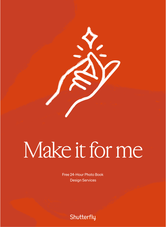
To power everything from their iOS app to e-comm and marketing, we built custom libraries of handwritten marks and expressive icons—tactile, ownable elements that bring emotion to every click, swipe, and scroll.
Getting the tone just right
From day one, it was clear: while Shutterfly may be rooted in imagery, its future would be just as verbal as it is visual. Voice plays a vital role in expressing the brand’s value—delivering a tone that’s equal parts helpful and heartfelt.
We crafted a conversational style that inspires without overreaching, guides without overwhelming. It’s emotionally resonant but always clear—designed to reflect the ease of Shutterfly’s experience and the warmth of the memories it helps preserve.

Infusing beauty into the functional
In a world of constant promotions and performance marketing, utility can often overshadow craft. For Shutterfly, elements like the dot whack—those bold, often disruptive promo stickers—had long been treated as necessary evils. Effective, but rarely elegant.
Rather than reject it, we reimagined it. By softening the form, refining the palette, and infusing it with warmth, we transformed the dot whack into a brand-forward moment. What once felt intrusive became a subtle, nostalgic nod—still driving action, but now aligned with the heart of the brand.
Always prototyping the brand
For a brand to live and breathe in digital, it can’t stop at the moodboard. We moved quickly from concept to component, prototyping the identity across web and product to pressure-test it in real contexts.
This rapid, iterative approach ensured that every visual and verbal element not only looked right—but worked right—across Shutterfly’s digital platforms. Because in today’s world, a modern brand isn’t built in theory. It’s built in motion.
It’s been so rewarding to see the Shutterfly and Snapfish work roll out the past few months – the team should be so proud of the foundation you created for us to build upon. Everyone loves it!

Our Role
DESIGN
- Brand Refresh
- Creative Direction
- UI & UX Design
CONTENT
- Copywriting
- Photo Art Direction
- Illustration
STRATEGY
- Brand Strategy
- Content Strategy
- UX Strategy
- Audience Research


